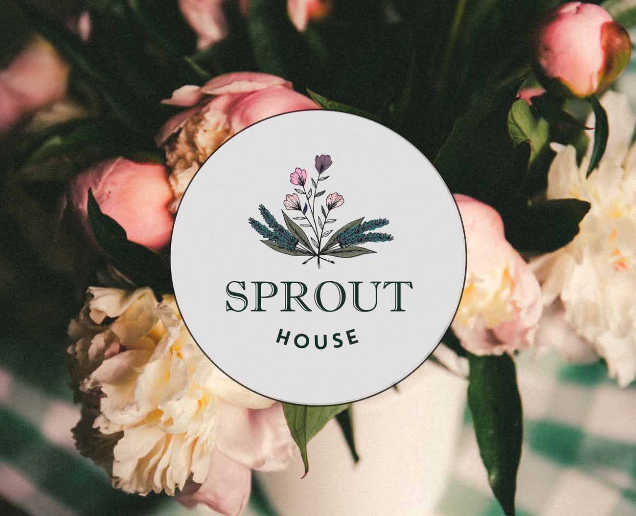
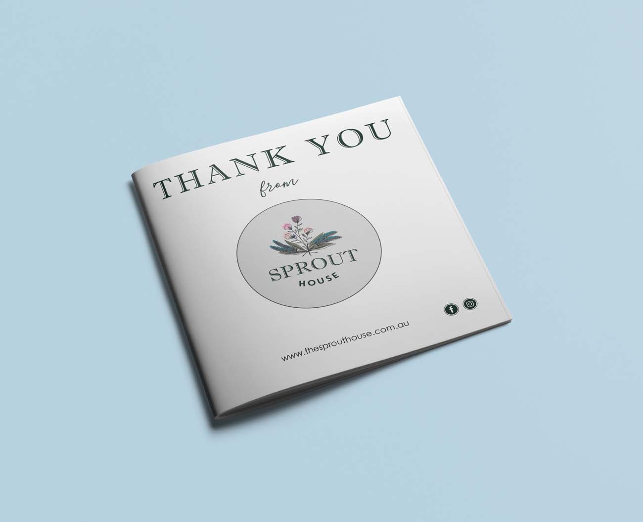
This logo was a redesign from the clients ‘online logo design’ purchase. The logo had good bones but no depth. So we developed a more sophisticated version of the logo and added colour and altered fonts. Bringing in the flower image is to be the basis of the growing brand development.
Info
Category:
Logo and corporate identityClient:
The Sprout House