LOVE SPACE
Using white space in design makes content easily scanned by the eye and improves legibility. Studies have proved that proper use of white space in between lines of paragraphs, margins and around imagery can increase comprehension up to 20%.
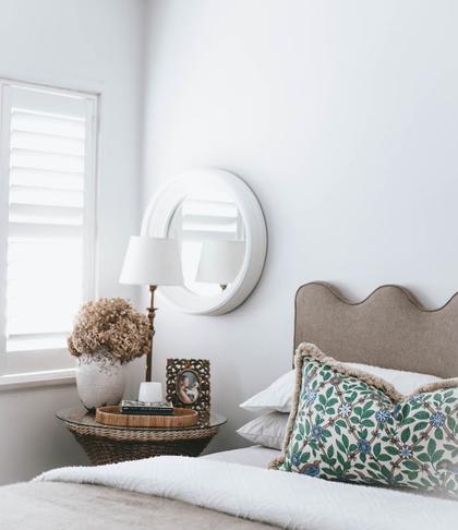
The human eye percepts an organised clean layout better than a cluttered space full of masses of visual imagery.
So when you are thinking about your document, blog, brochure or any advertising mediums use space to separate elements and create space for the eye to view your message.
0 Comments


